It all Happens Under the Arches.
Branding
Motion
Visual Identity

Red Bull London came looking for a brand identity that reflected their London HQ, their people and their vibe. On the initial site visit we locked in on the very foundation that it was built on.
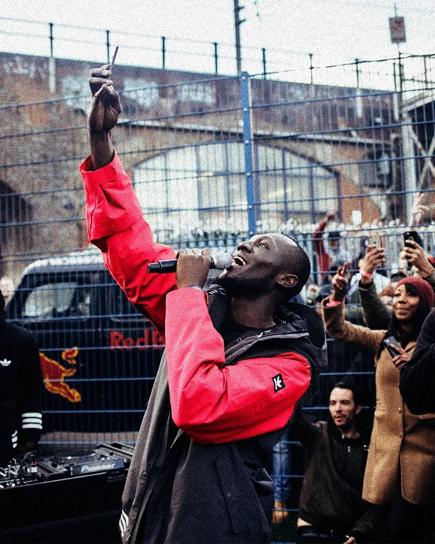
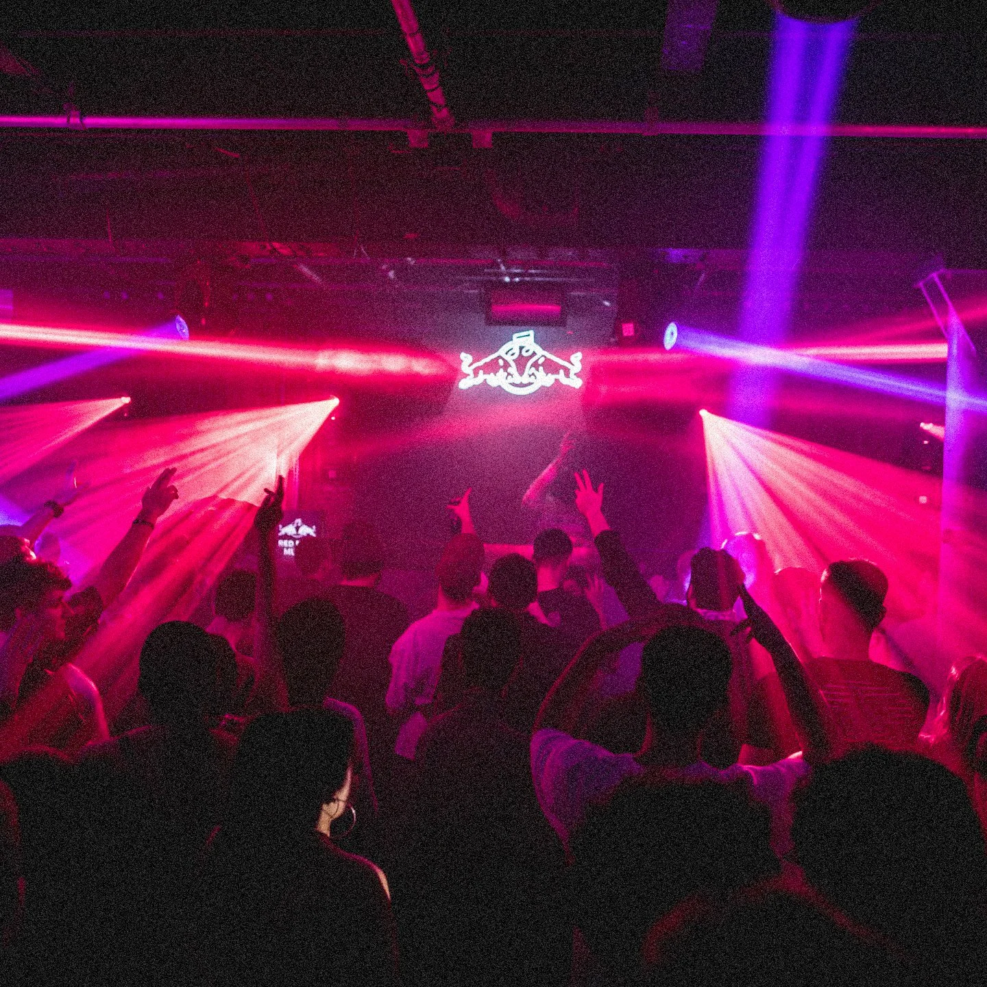
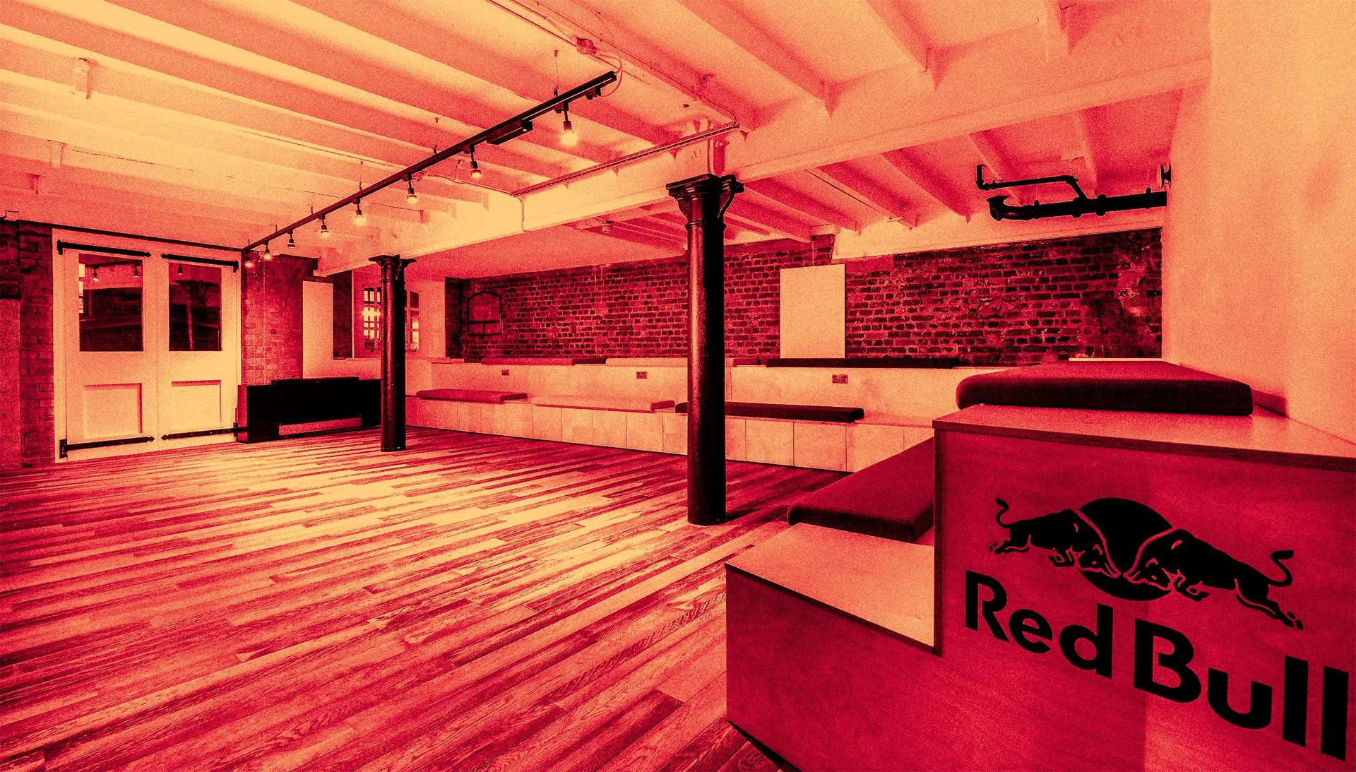
London has its own vibe. Red Bull London also has its own vibe. Its a tad edgier, more rebellious, a bit more street and a bit more cool. The Red Bull London HQ building is COOL. Live gigs, a skatepark for a boardroom… Arches are a feature throughout the historical building and the ones in the basement are where things happen. Its the meeting point, hangout spot and events space. It all happens under the arches.
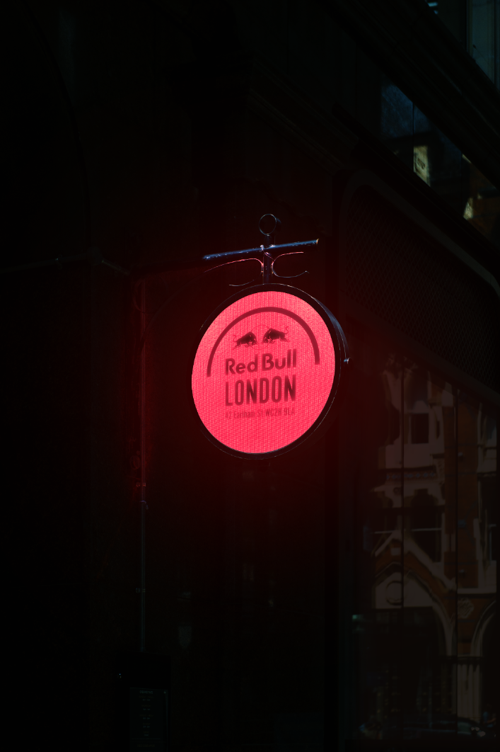
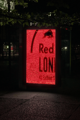
The Logo
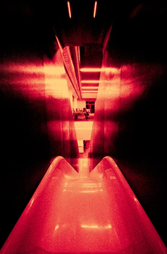
Since the arch is where it all happens, we used it as the defining feature and roof over a simple type lockup. The curve of the arch mirrored the top of the circle in the Red Bull logo giving a nod to its heritage. The arch is a symbol that can live comfortably in the physical world as much as the digital one; in lighting, stage props, furniture and more.
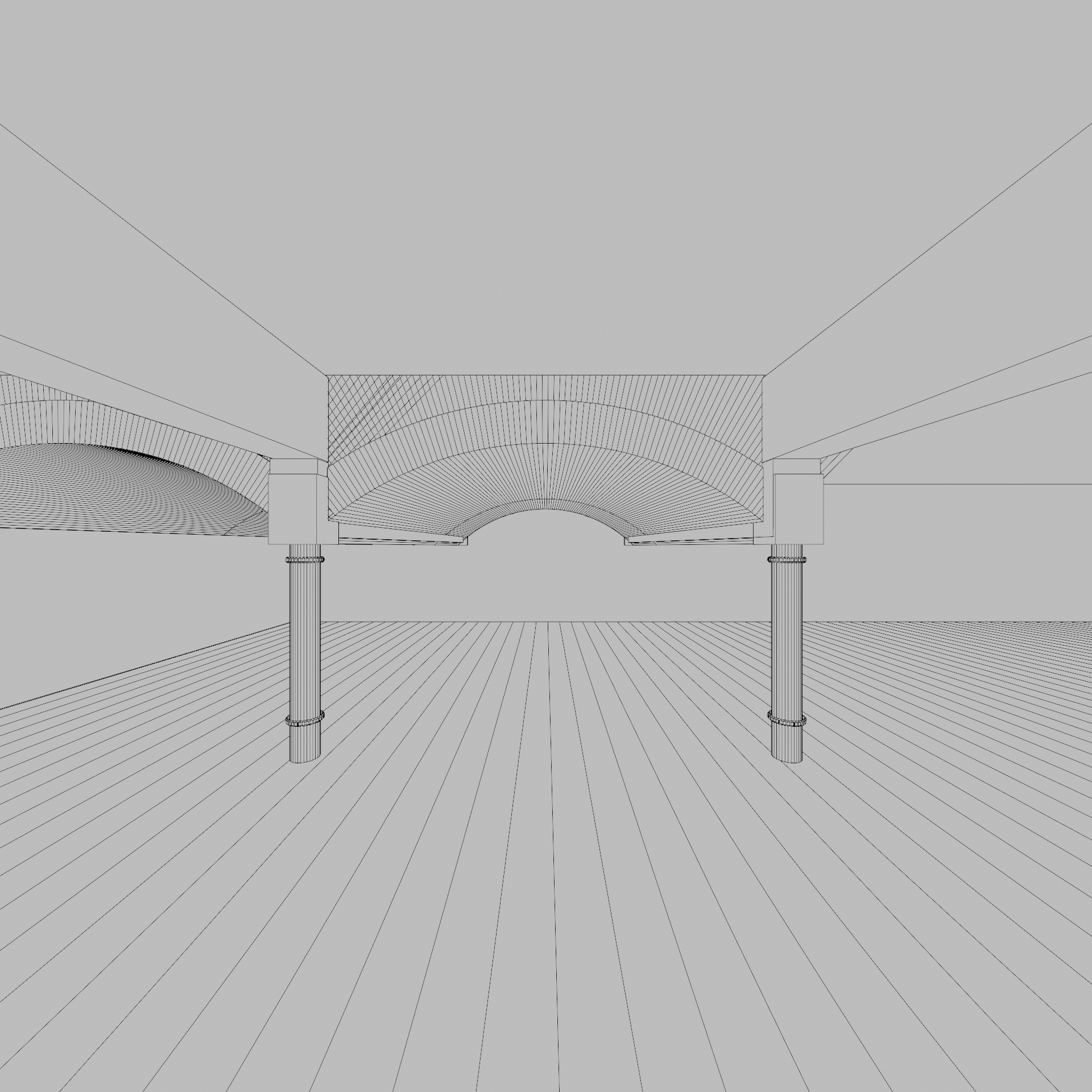
The Arch
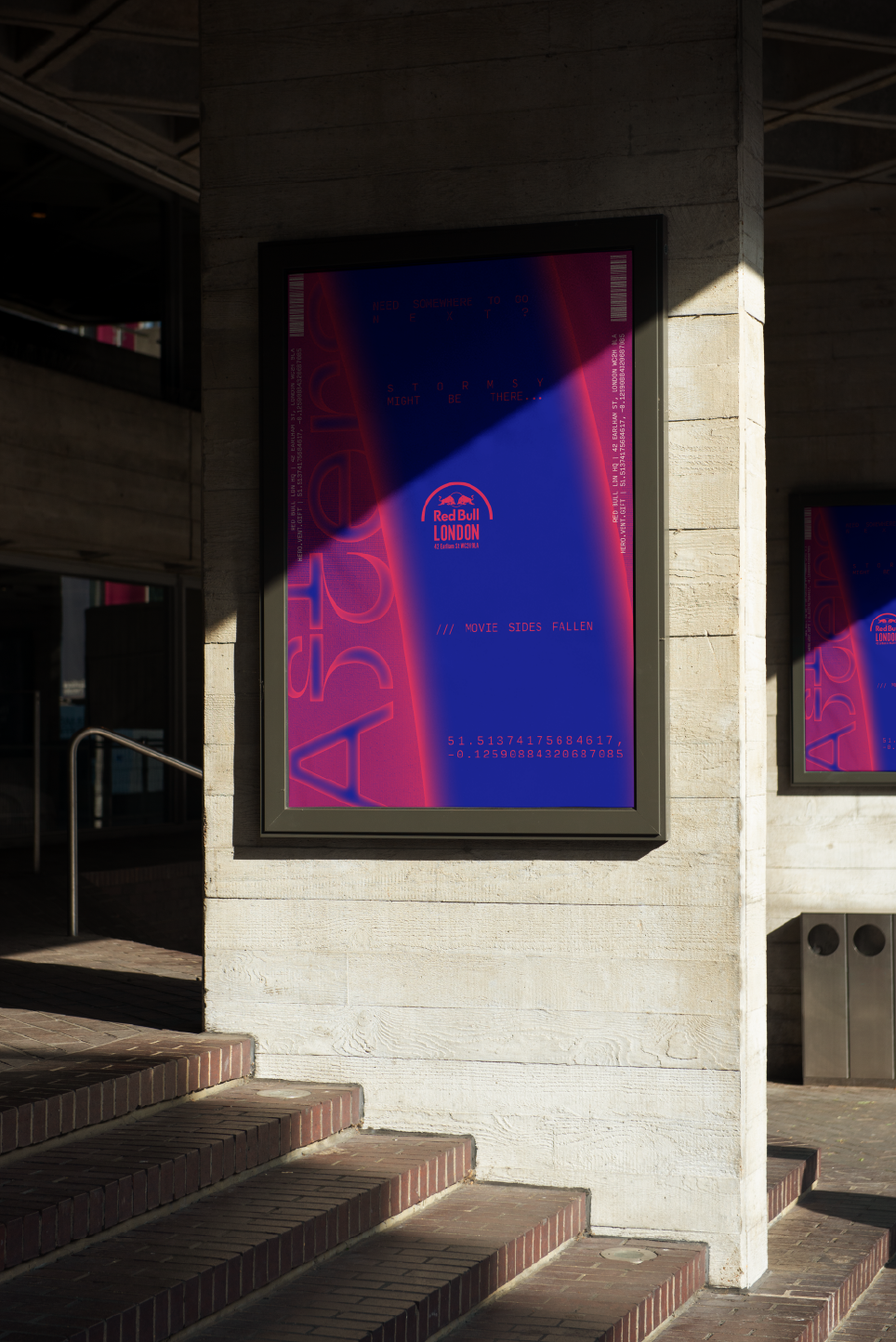
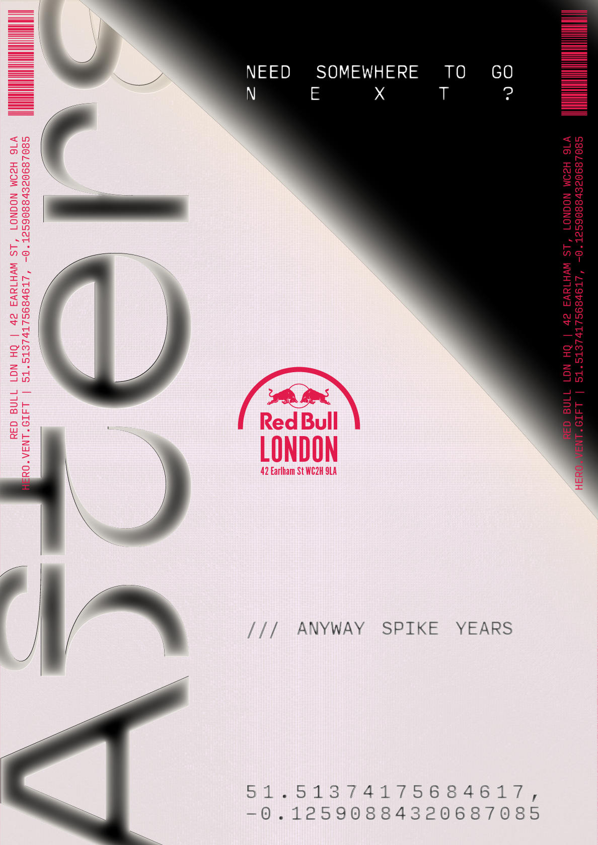
The arch itself can be imagined as a conduit for all the excitement that goes on in and around Red Bull LDN. It becomes an omnipotent object that can react and transmit, forming textural environments for creating unique content.
It holds the very energy of the community that come to celebrate and share.
The arch is often used at a much larger scale in design assets, often breaking the boundaries of the execution, mirroring the scale and ambition of Red Bull as a brand and the community that gathers under the arches.
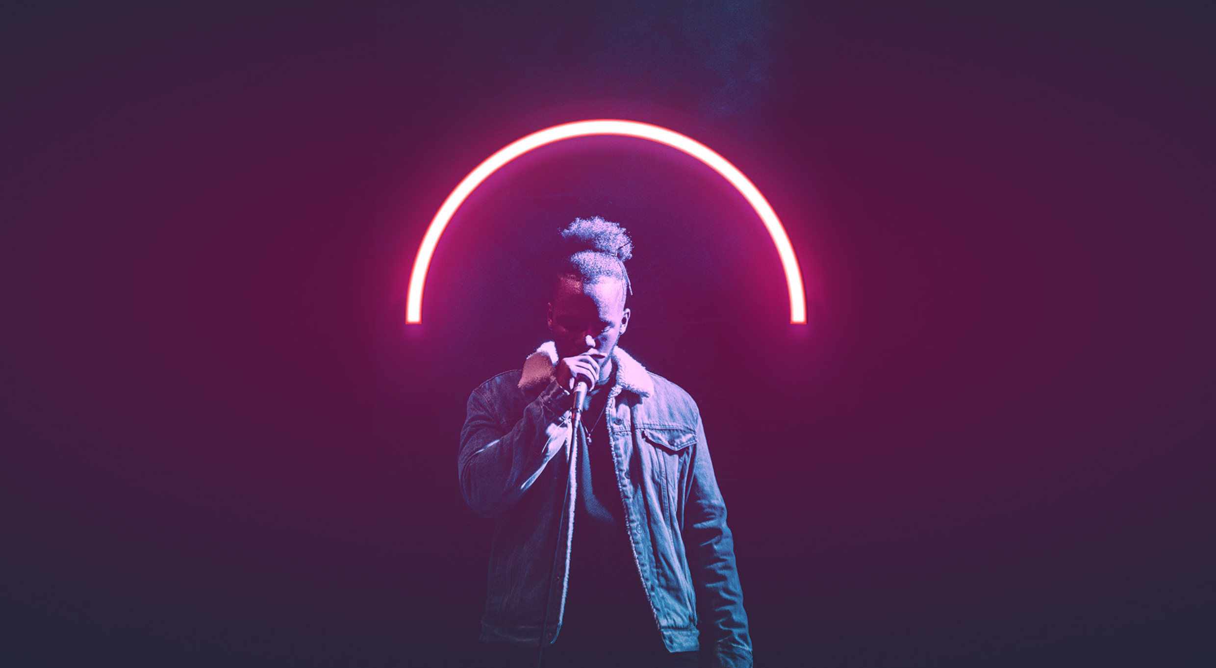
The Execution
This concept of being bigger than the space provided, translates through content layouts. The arch, and even the logo sometimes, are many times bigger than the frame. One of the most recognisable marks in history is slap bang in the middle, so we had some freedom to play with.