Creating a visual identity for Red Bull Sound Space
Branding
Motion
Visual Identity
All under one roof
Red Bull came to us looking for an identity for their podcast studio’s, one that represented the cutting edge artists and creatives that would feature on their podcasts.
As the studio was an integral part of the HQ we revisited our Red Bull London identity where we focussed on the characteristic arches in the HQ’s basement and used this as a starting point to allow the two identities to feel fully connected.
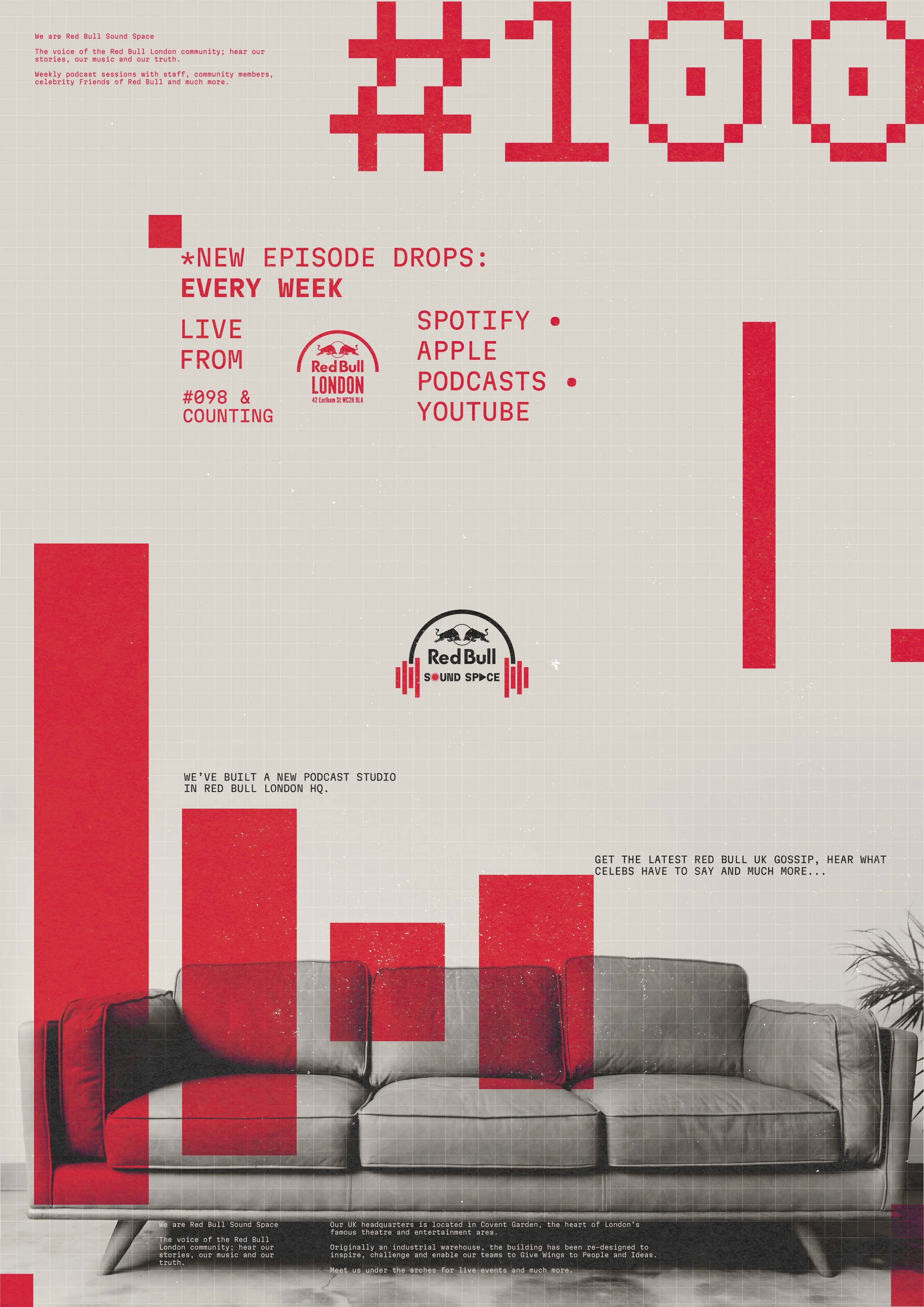
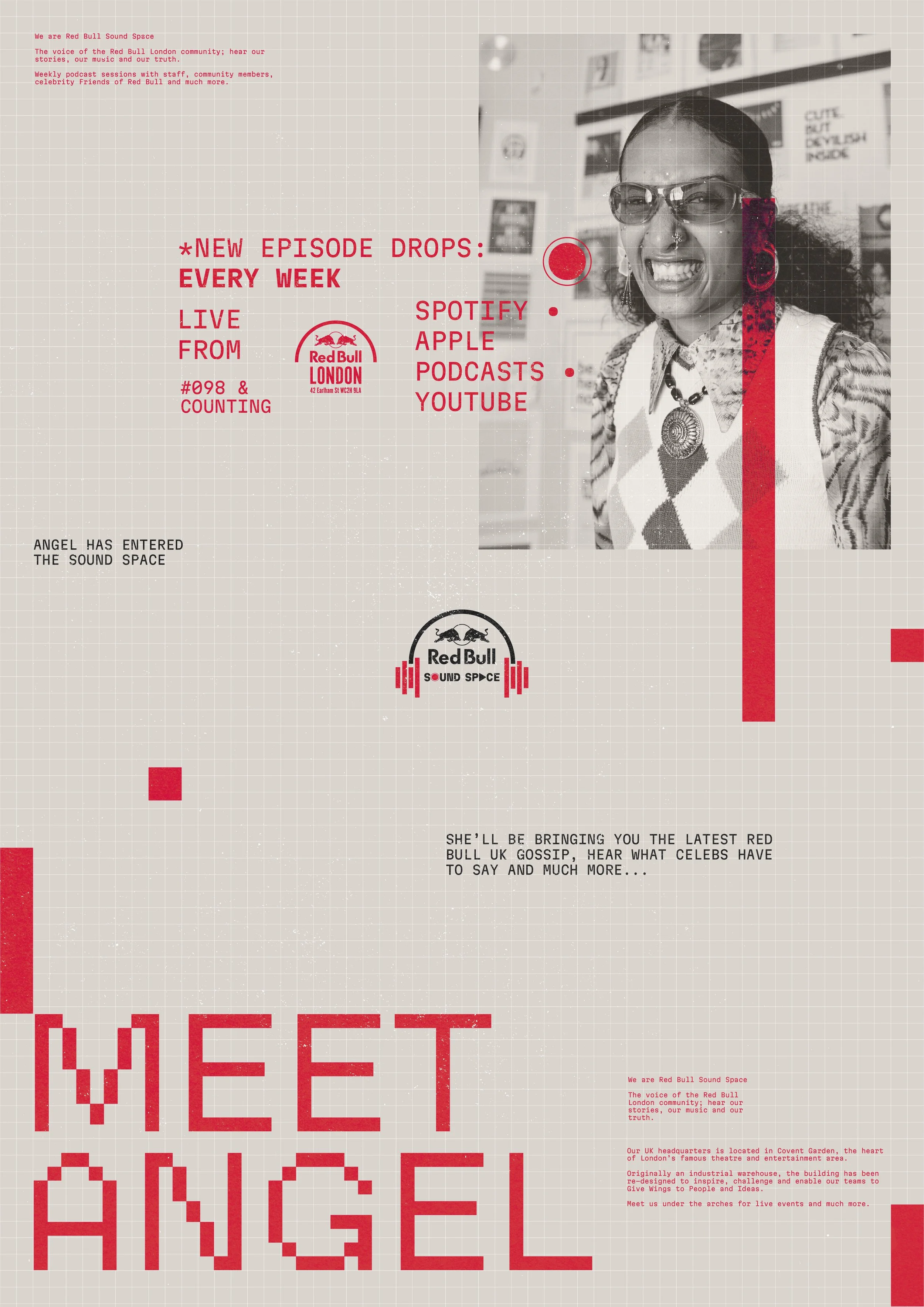
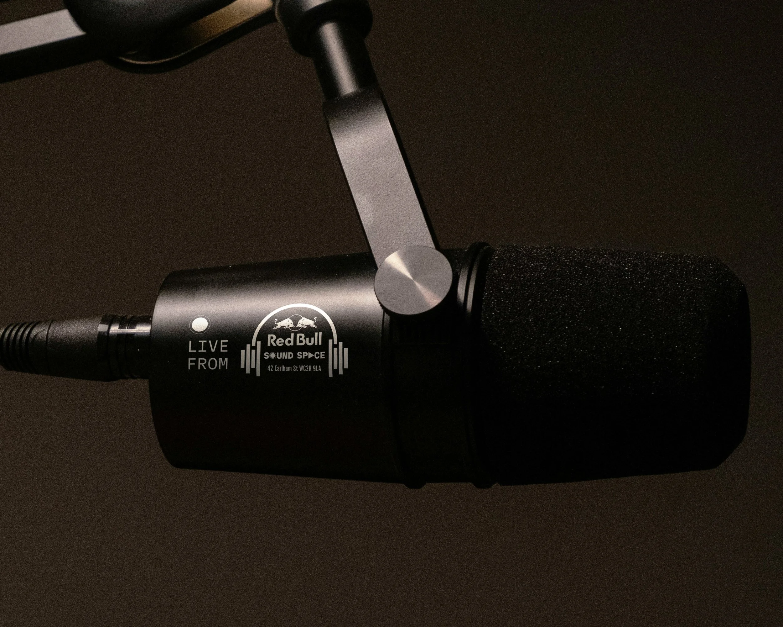
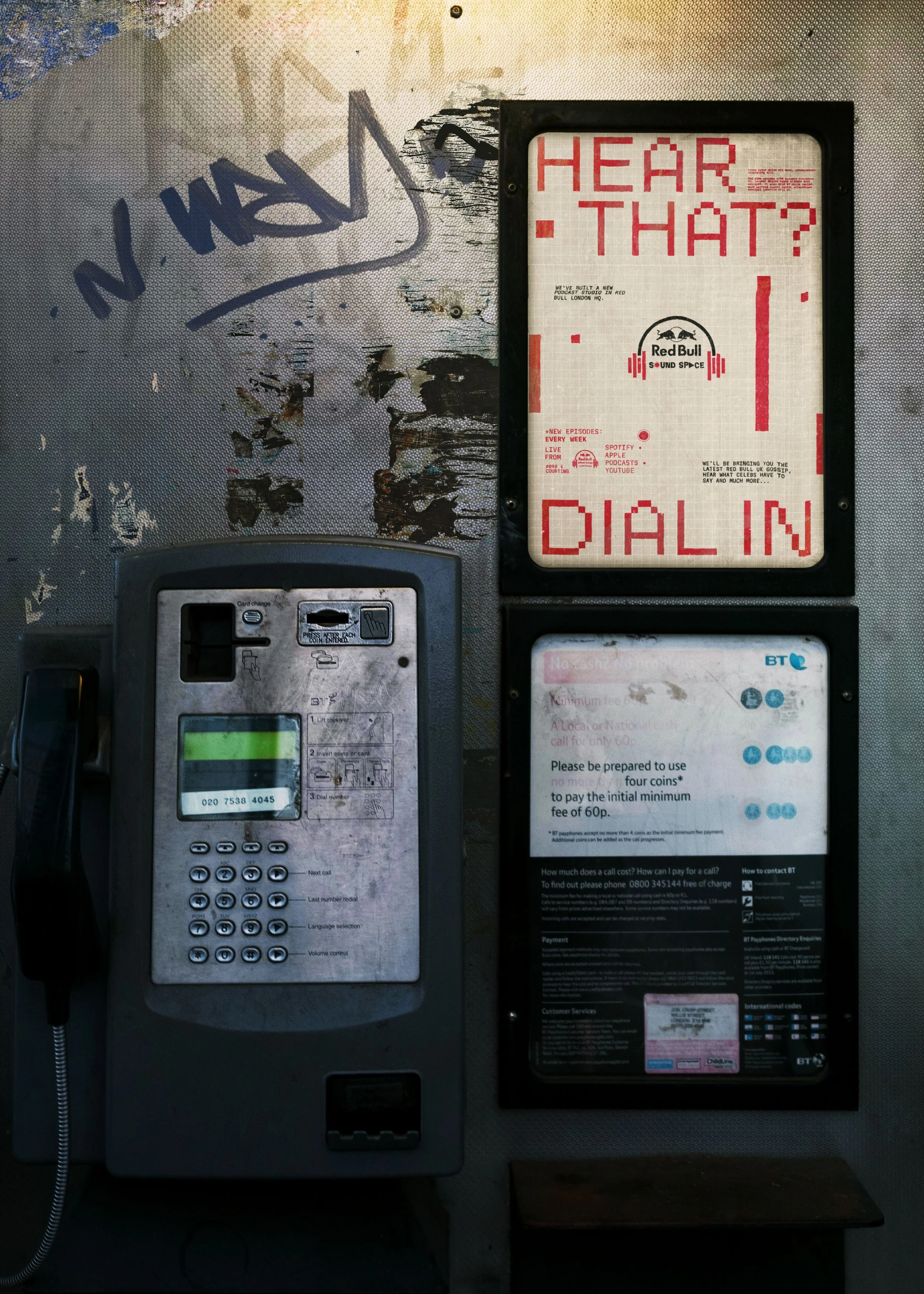
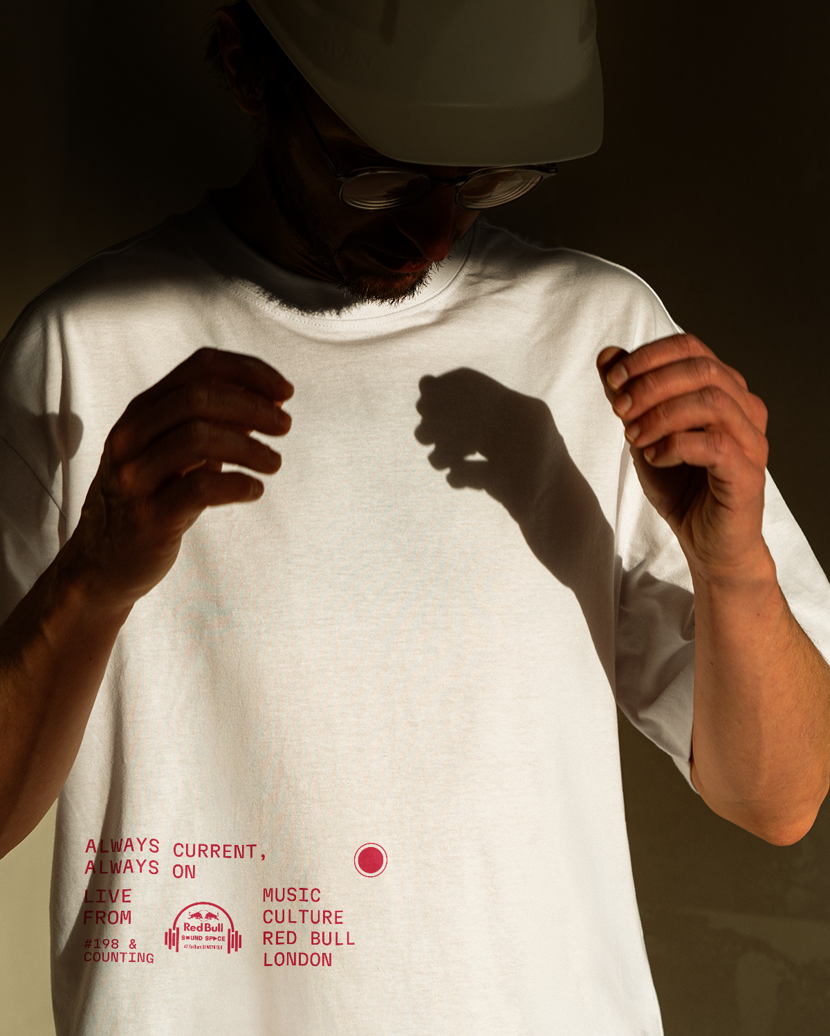
Sound Space is a new podcast studio based in the heart of the Red Bull London HQ. It’s a space for the Red Bull community to connect with the brand in an authentic way; that distinctive London edge included.

Creating the Logo
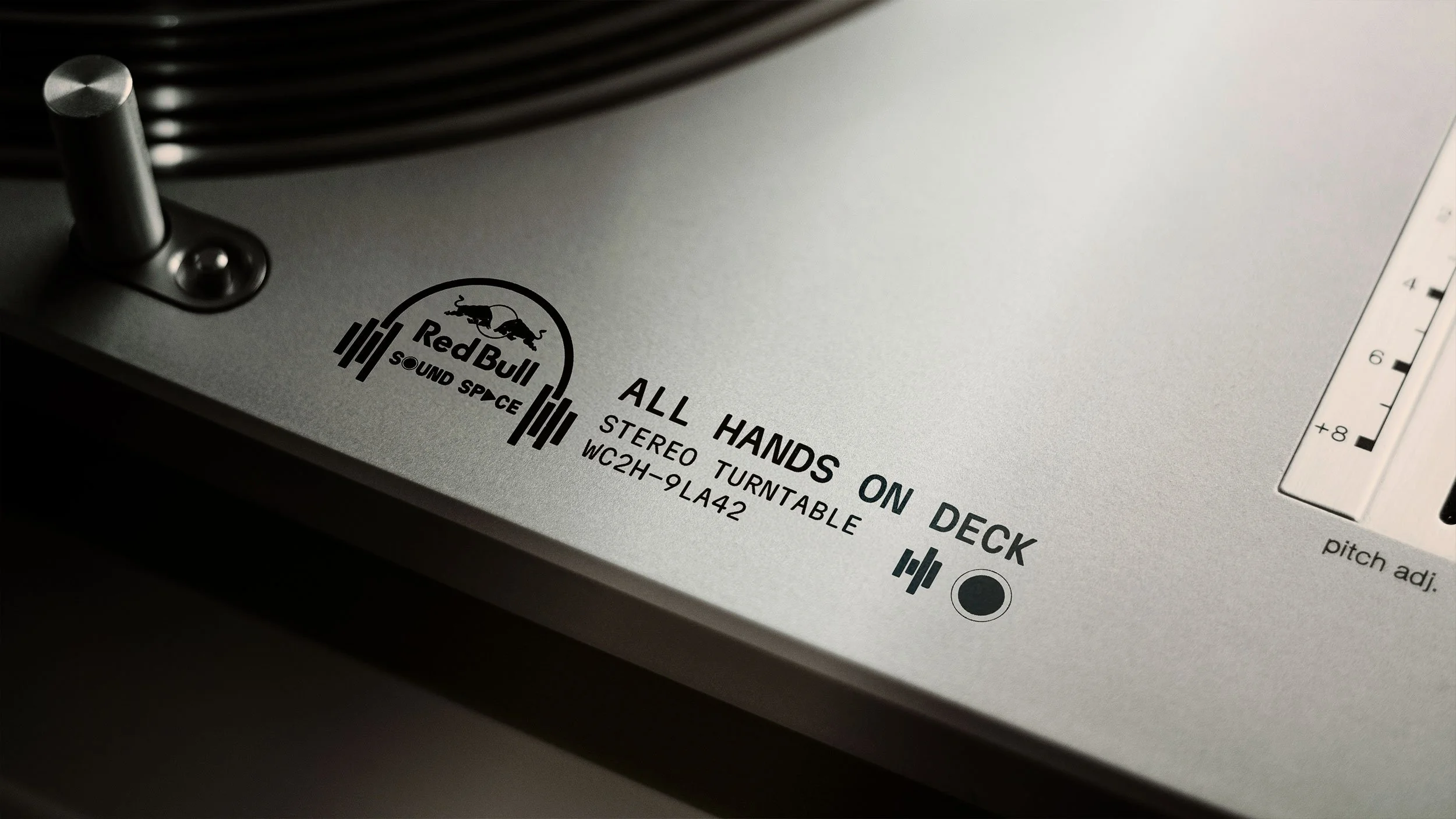
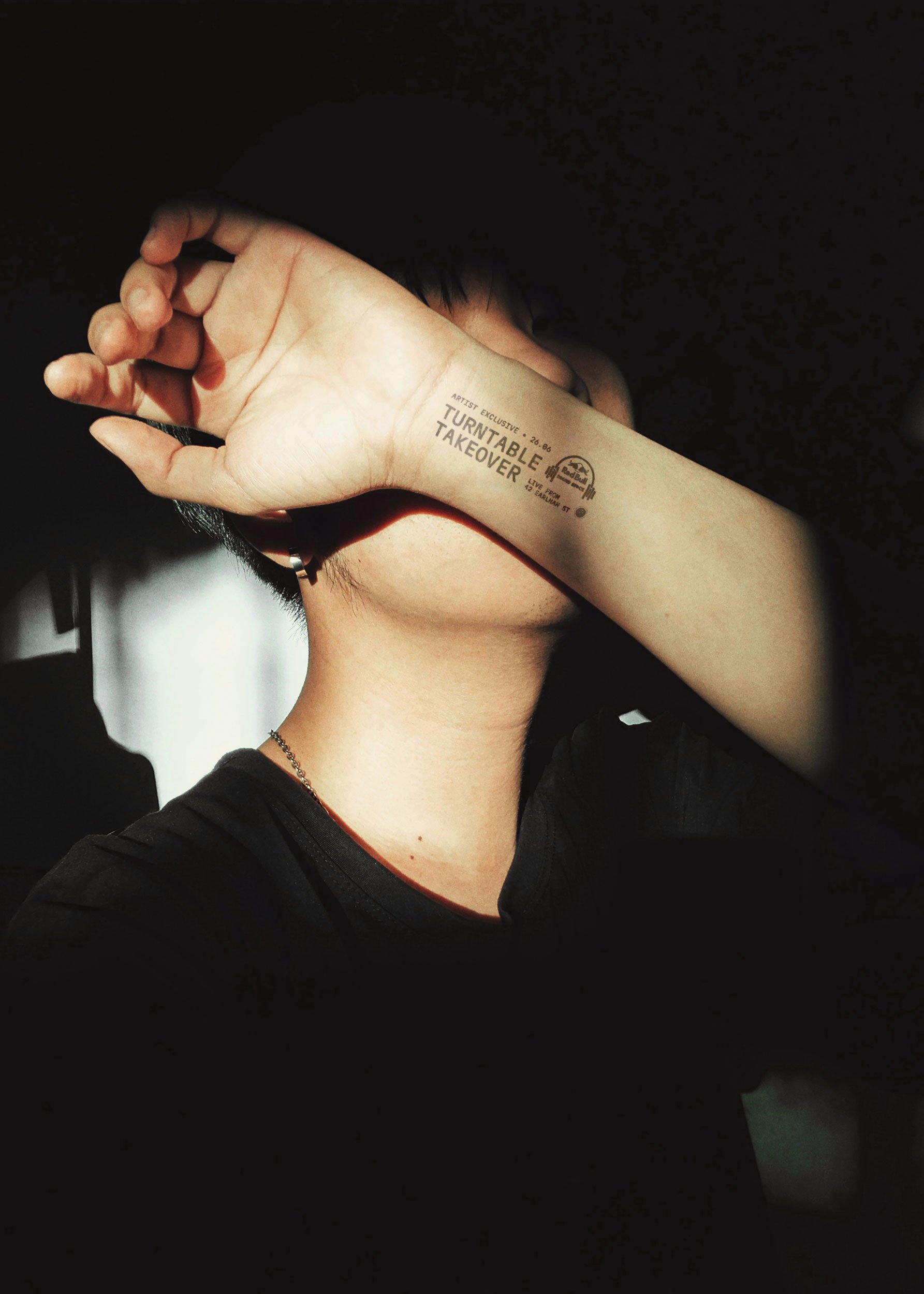
We developed the sound space logo around the core Red Bull London logo, with an aim to build out a family of logo marks for the iconic HQ. A multi-layered logo visually, with sound wave bars combining with the Red Bull London logo to make headphones, coupled with visual prompts in the typography.


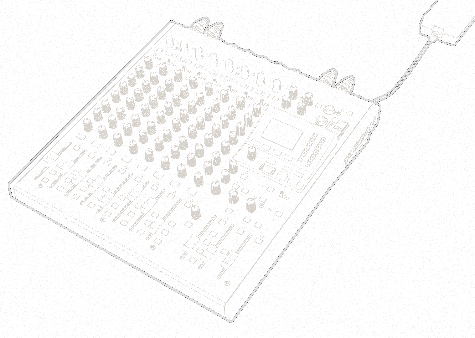
Building out the identity
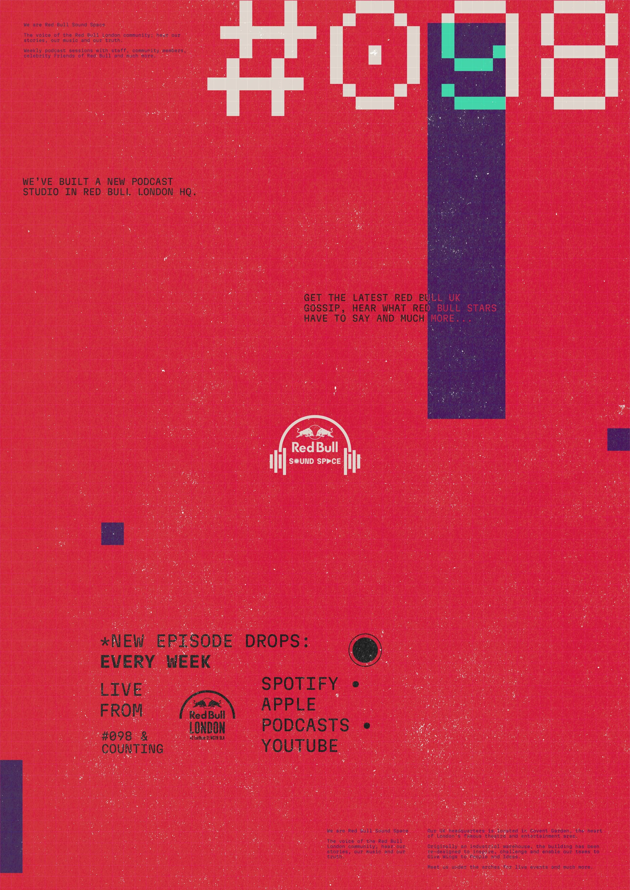
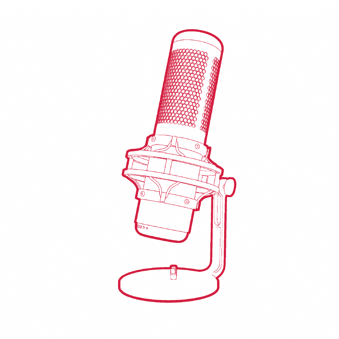
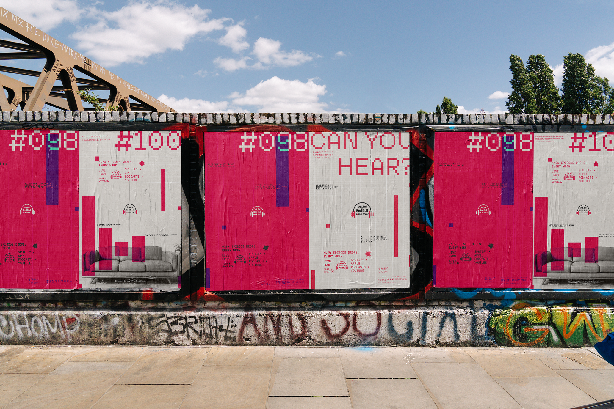
A base grid sits in the back of all designs giving a digital feel to the identity, the waveform from the core logo becomes a graphical device that can be played with in broader design executions, imagery is mono and outlined allowing ease of placement across outputs, meaning that designs can be produced fluidly.

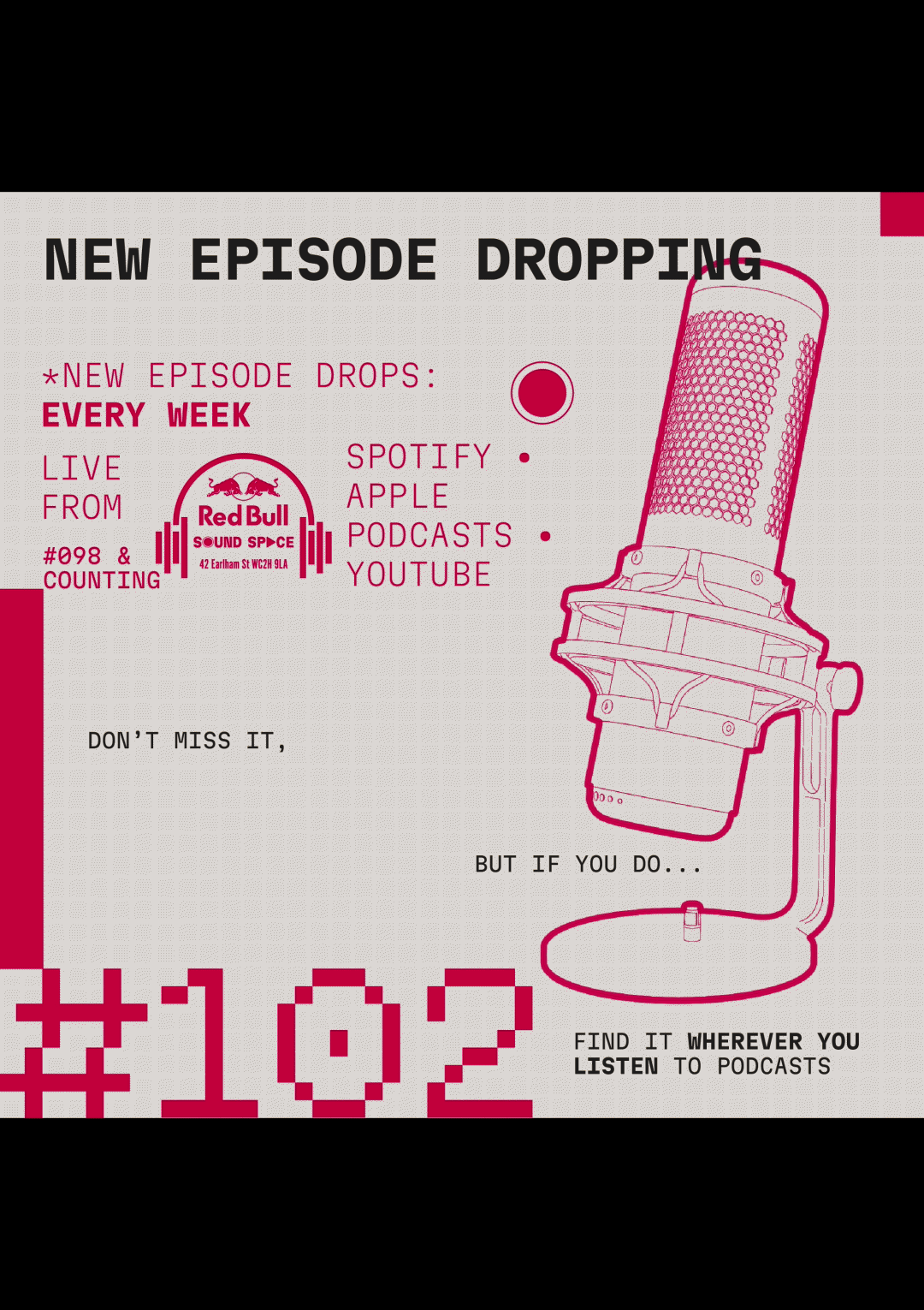
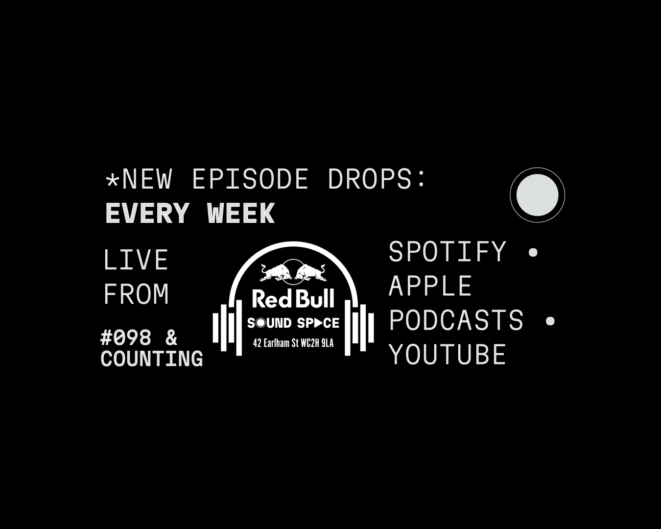
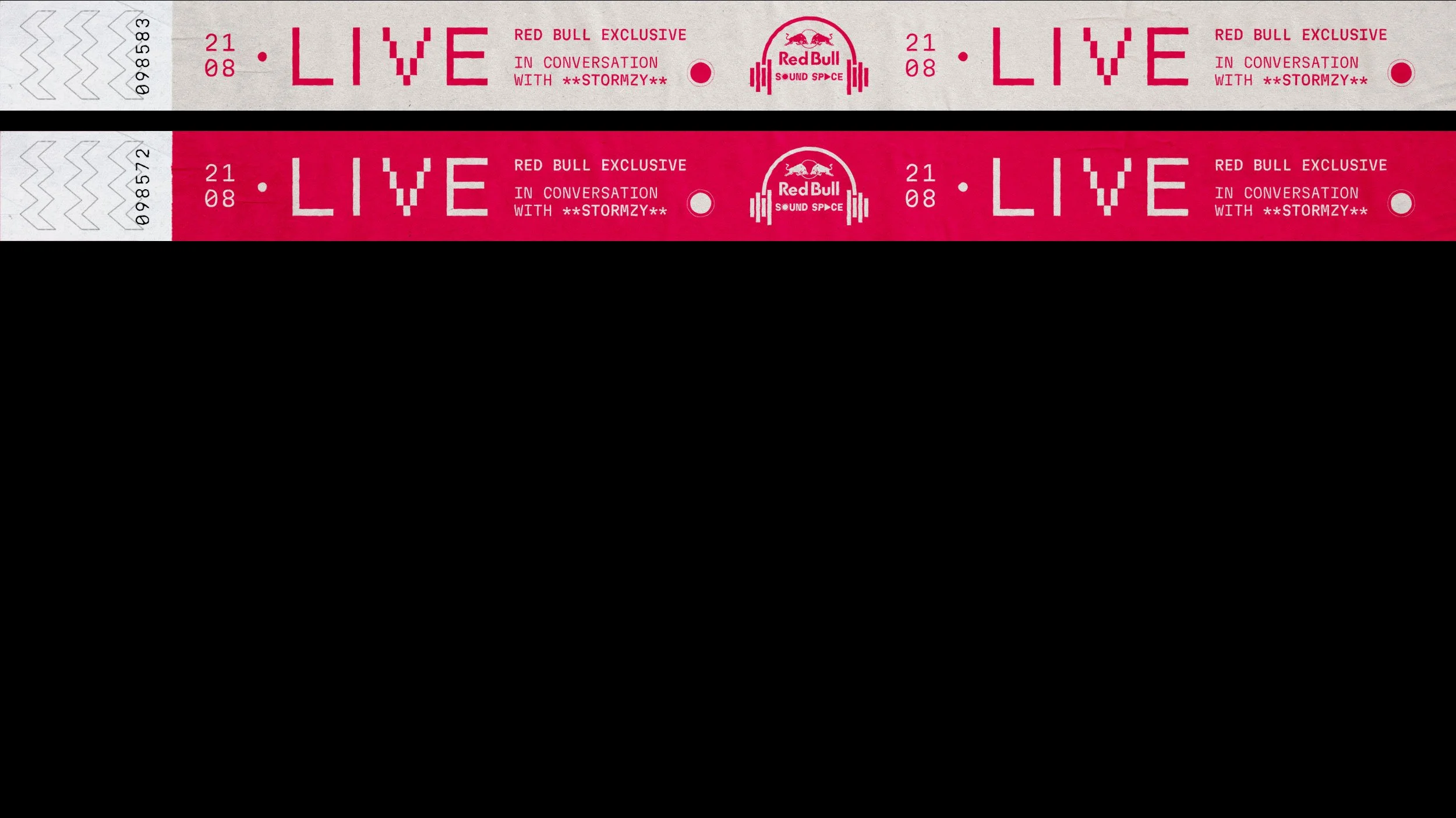
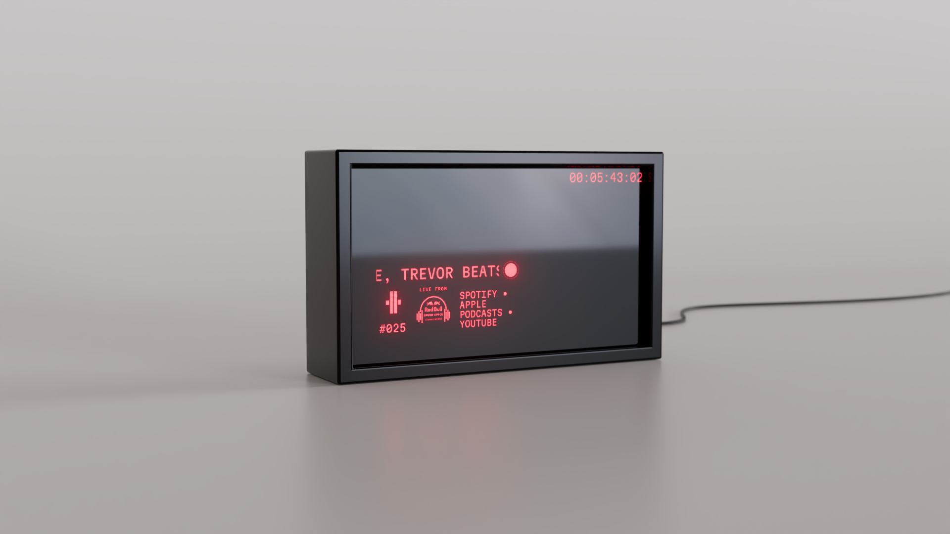
Podcasts don’t have to stay put…
Layout
Podcasts don’t have to stay put, and Red Bull isnt known for staying still either. The info layer is a label tag, with templated layouts that can be updated on the fly. It delivers the core information of what you’re hearing because thats the point of podcasts, they’re simple and authentic.