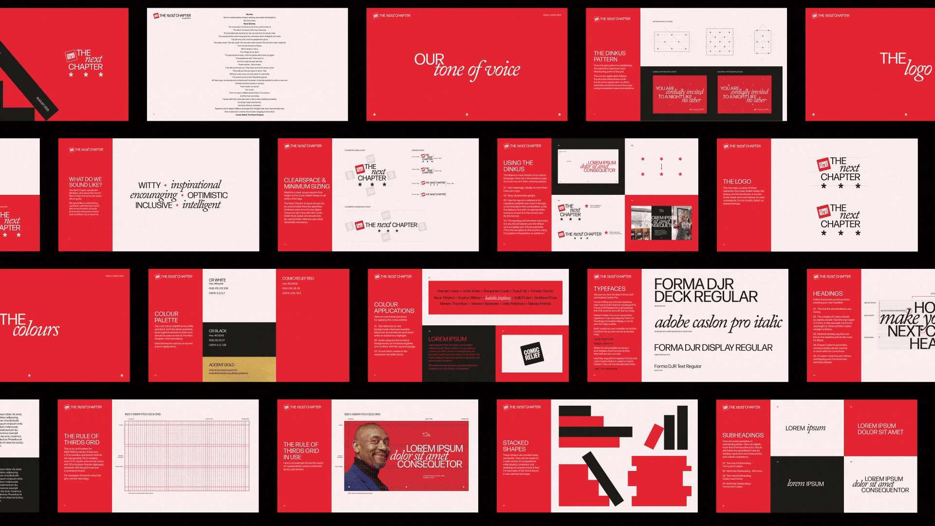
The Next Chapter
Visual Identity
Branding

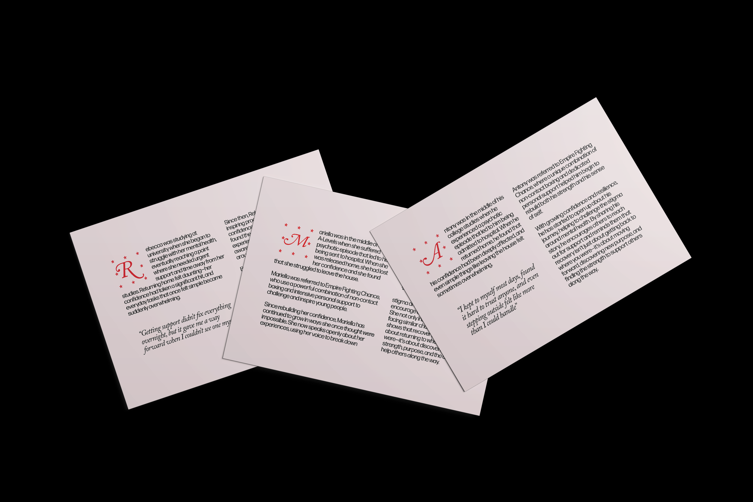
A story 40 years in the making
To mark its 40th anniversary, Comic Relief approached us to develop the identity for a programme aimed at key donors. The milestone was an opportunity not only to celebrate the achievements of the past four decades, but also to inspire excitement for the future — while keeping the focus firmly on the positive impact the charity continues to have on people’s lives and personal stories.
In response, we created an identity called The Next Chapter, inspired by the world of literature. The concept reflects a natural pause between chapters: a moment to recognise past achievements, reflect on the journey so far, and look ahead to the story still to be written with the continued support of its donors.
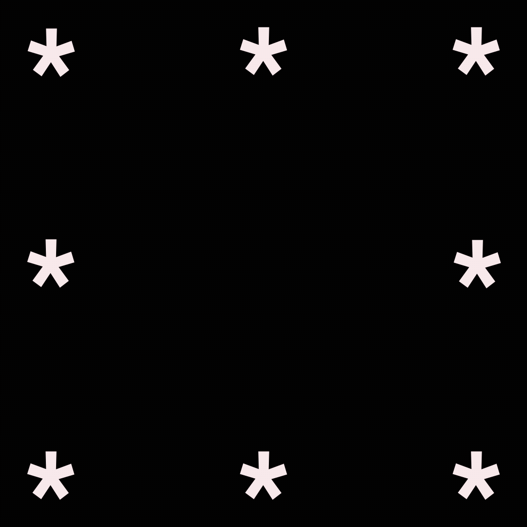

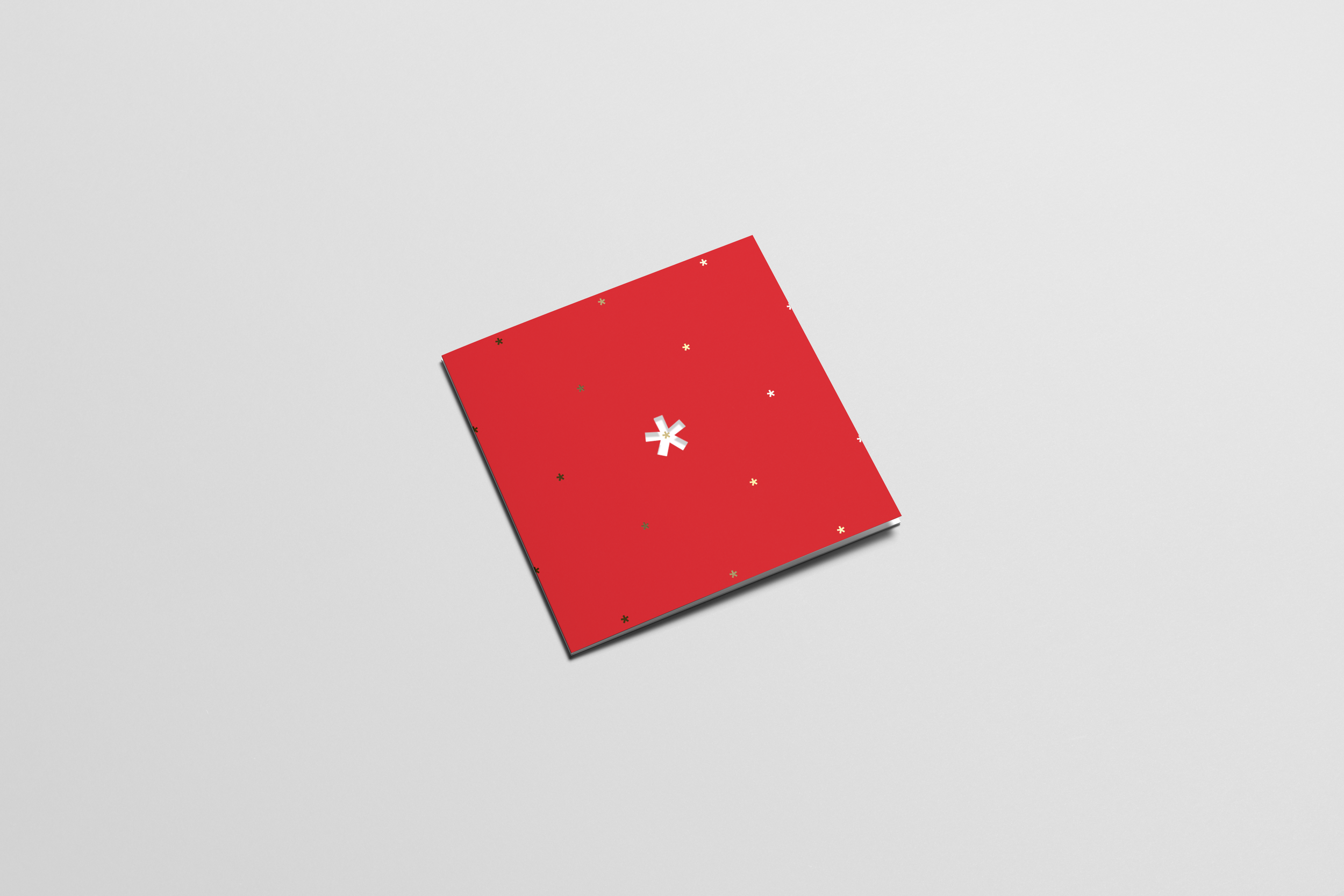
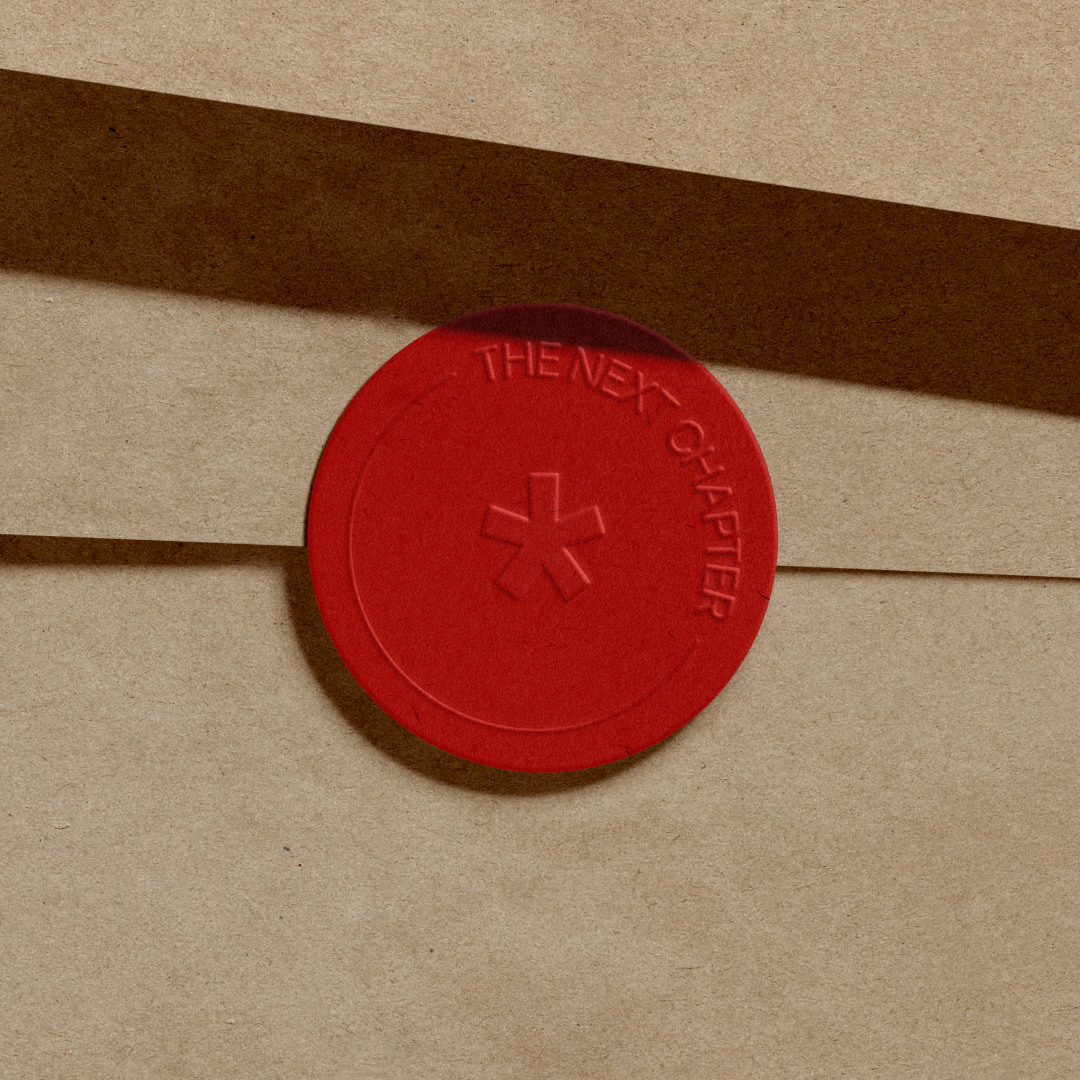
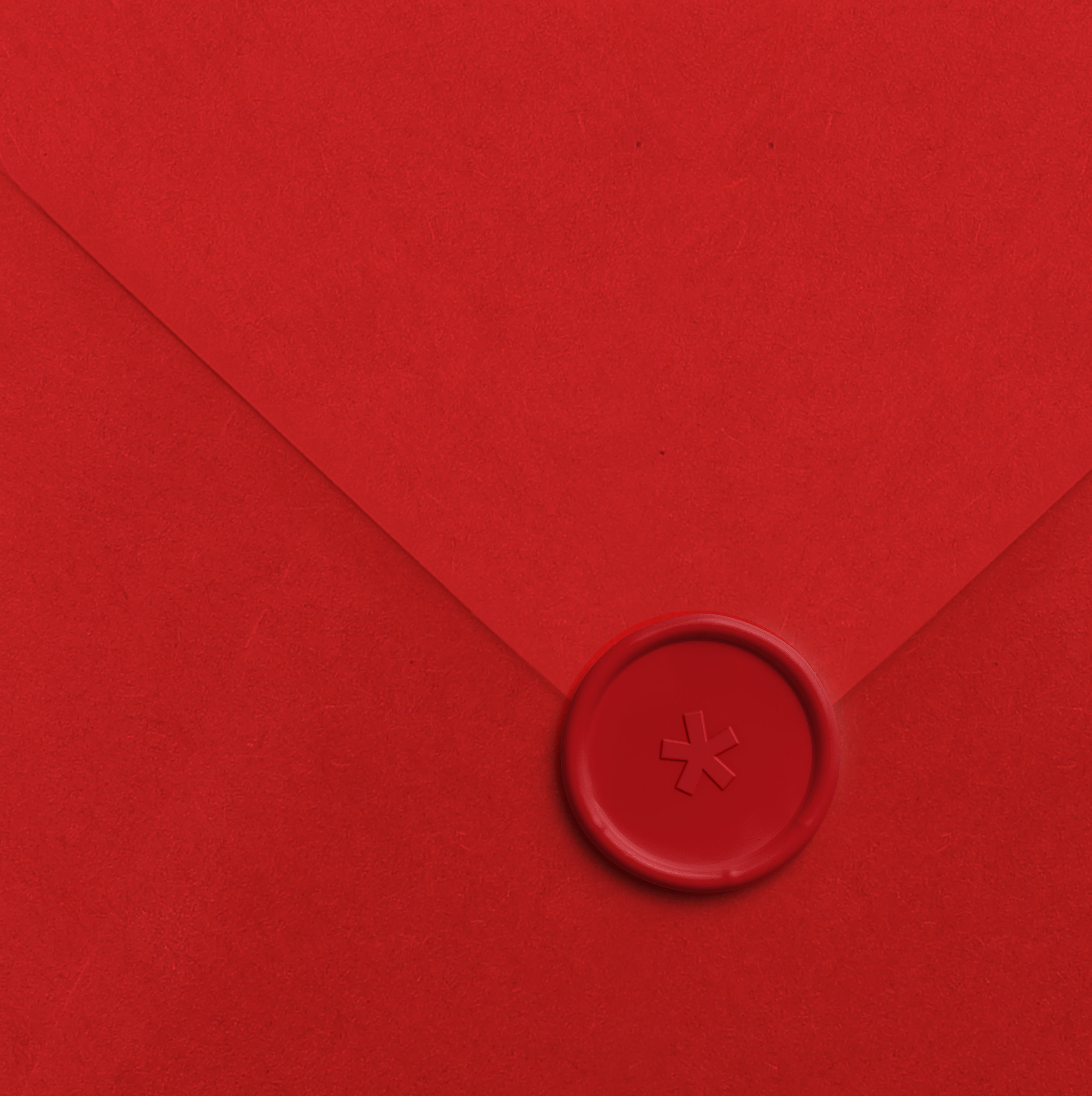
The Dinkus
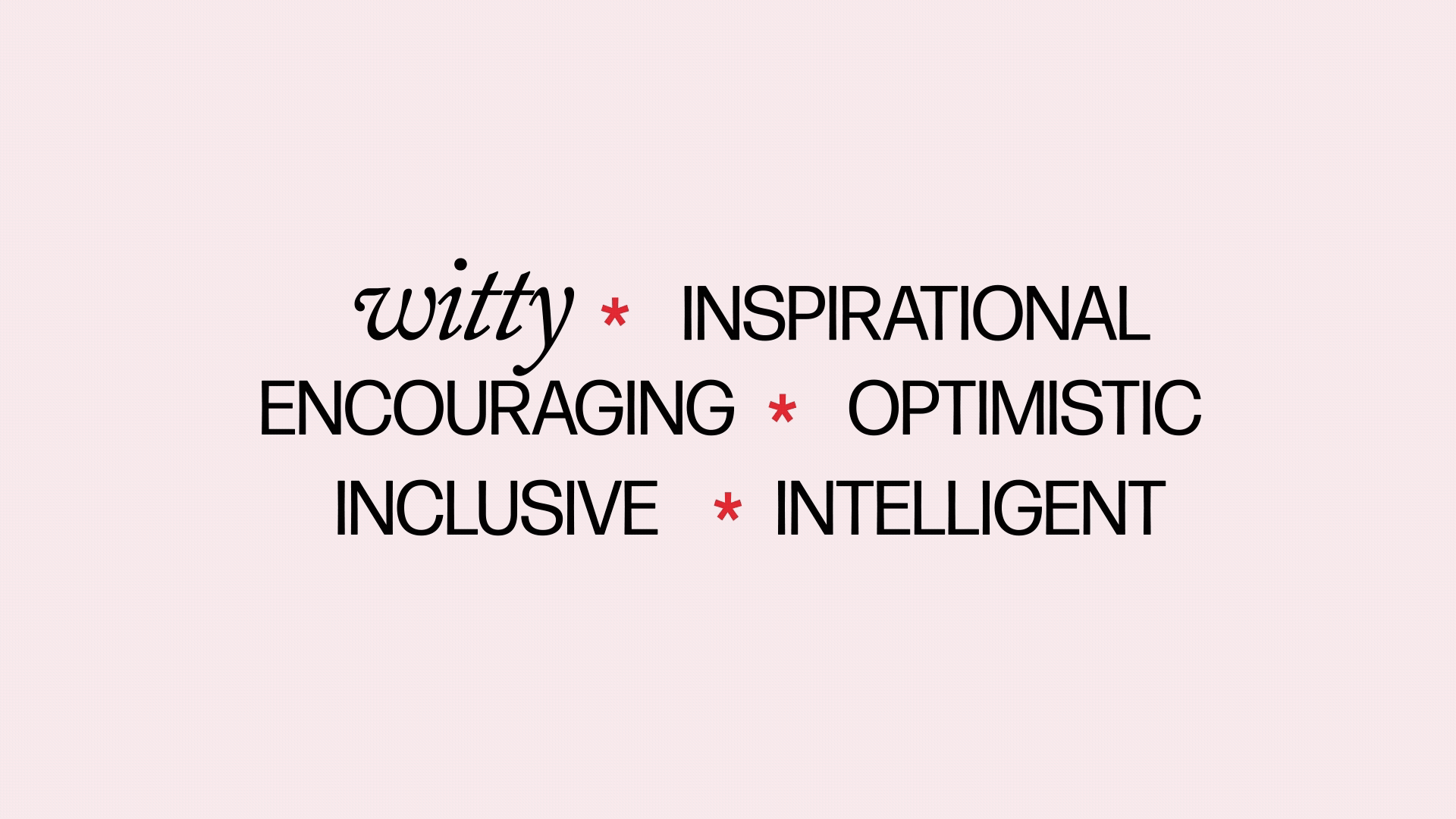
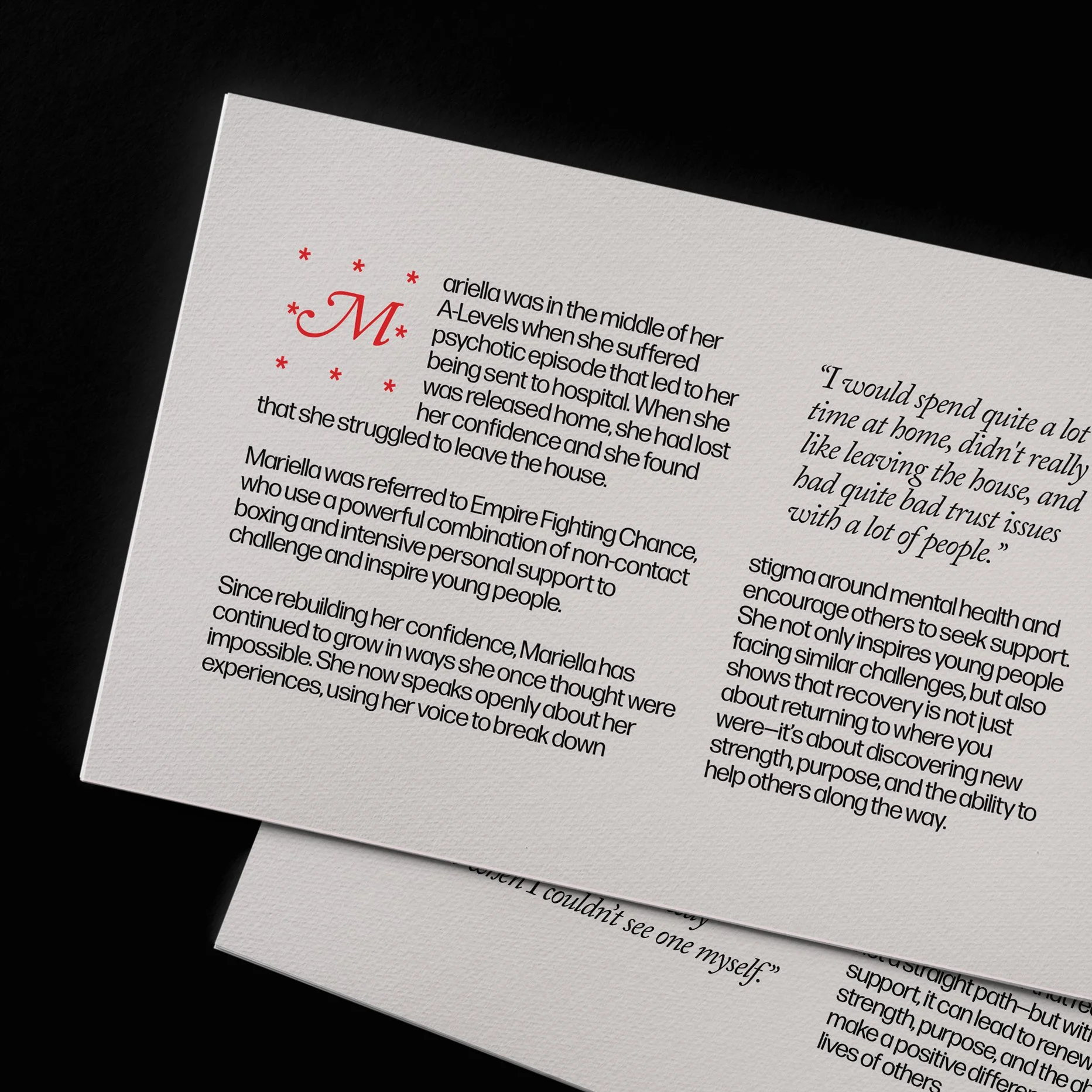
Tone of voice played a central role throughout the project, particularly when communicating the charity’s impact and recognising the significance of donor support.
To reflect this, the dinkus device is used thoughtfully and sparingly, always with intention and restraint. This creates a clear contrast to the energy and playfulness of Red Nose Day, presenting instead a more reflective and sophisticated side of the organisation.
‘A dinkus is a typographical device, typically three spaced asterisks (***), dots, or a small ornament placed between paragraphs to indicate a scene break, transition, or passage of time within a text.’
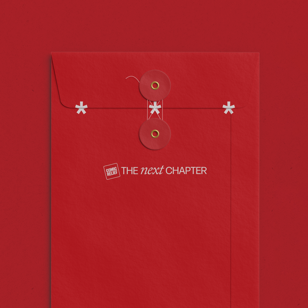
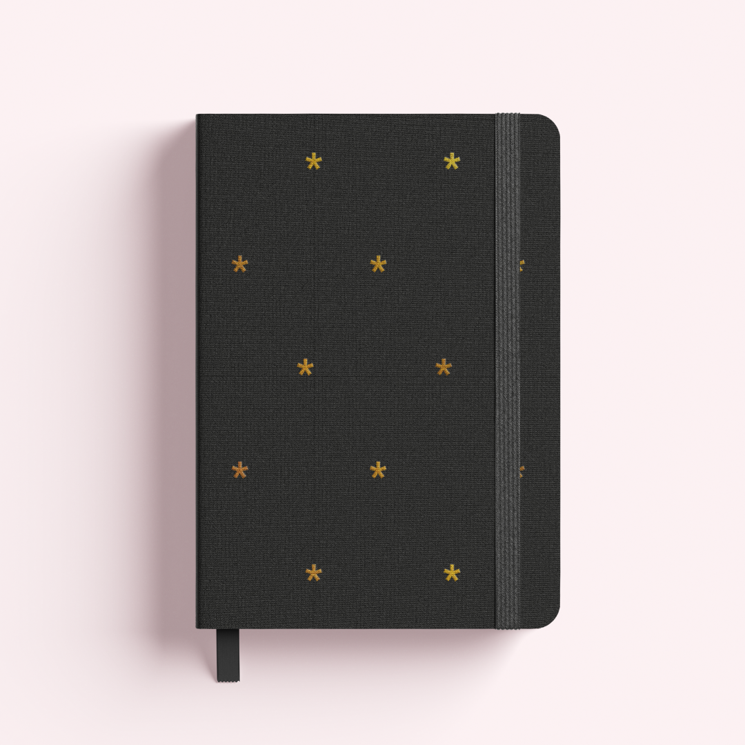


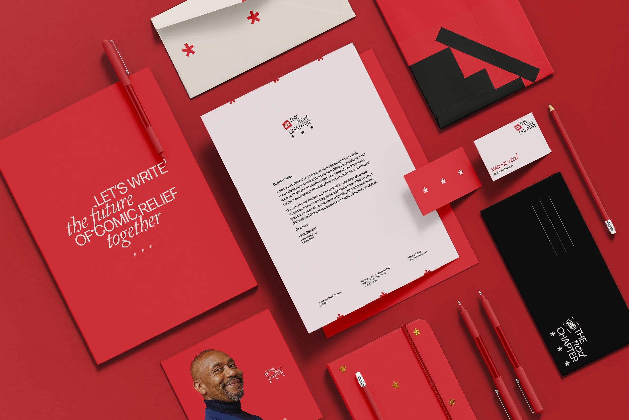
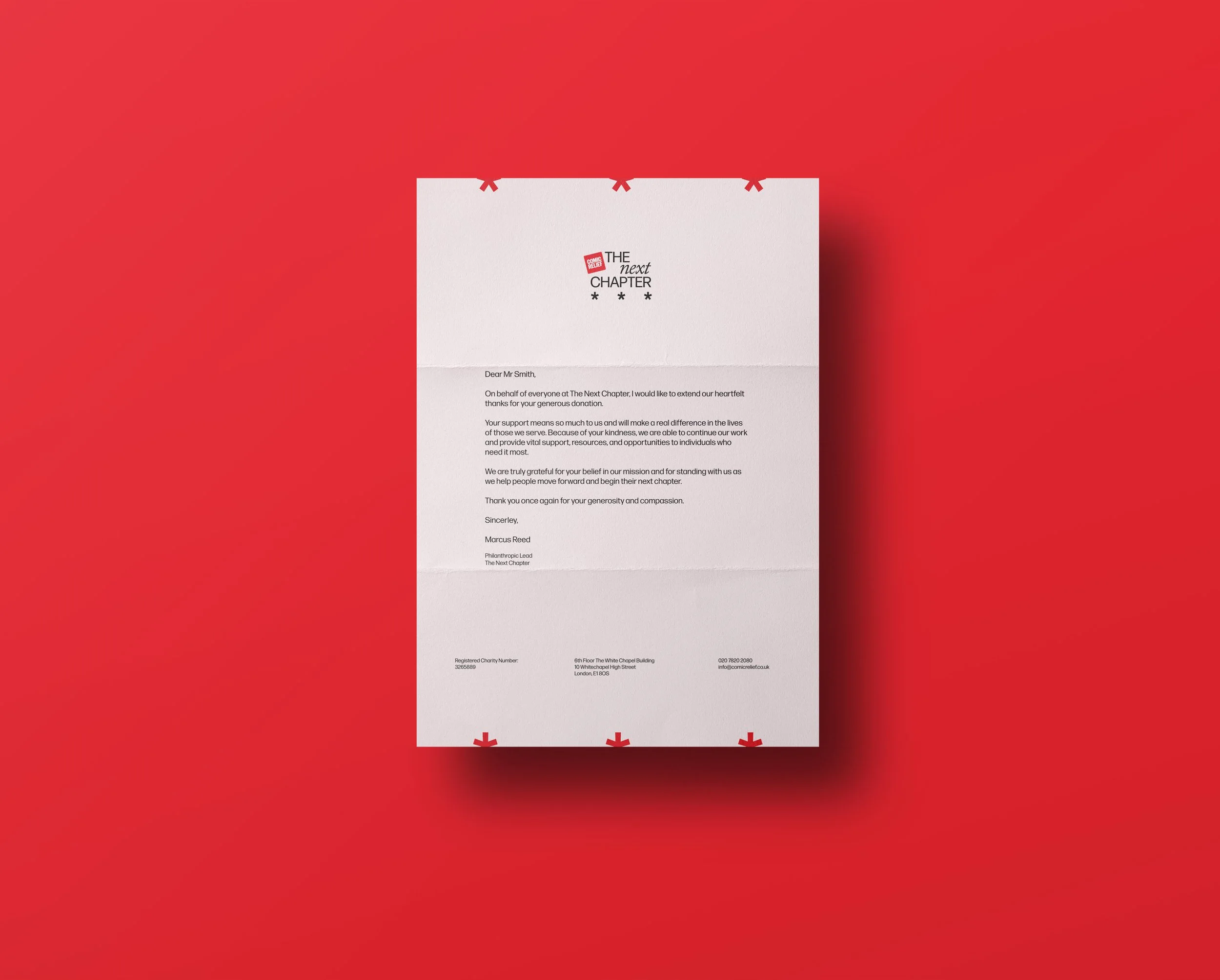
The execution
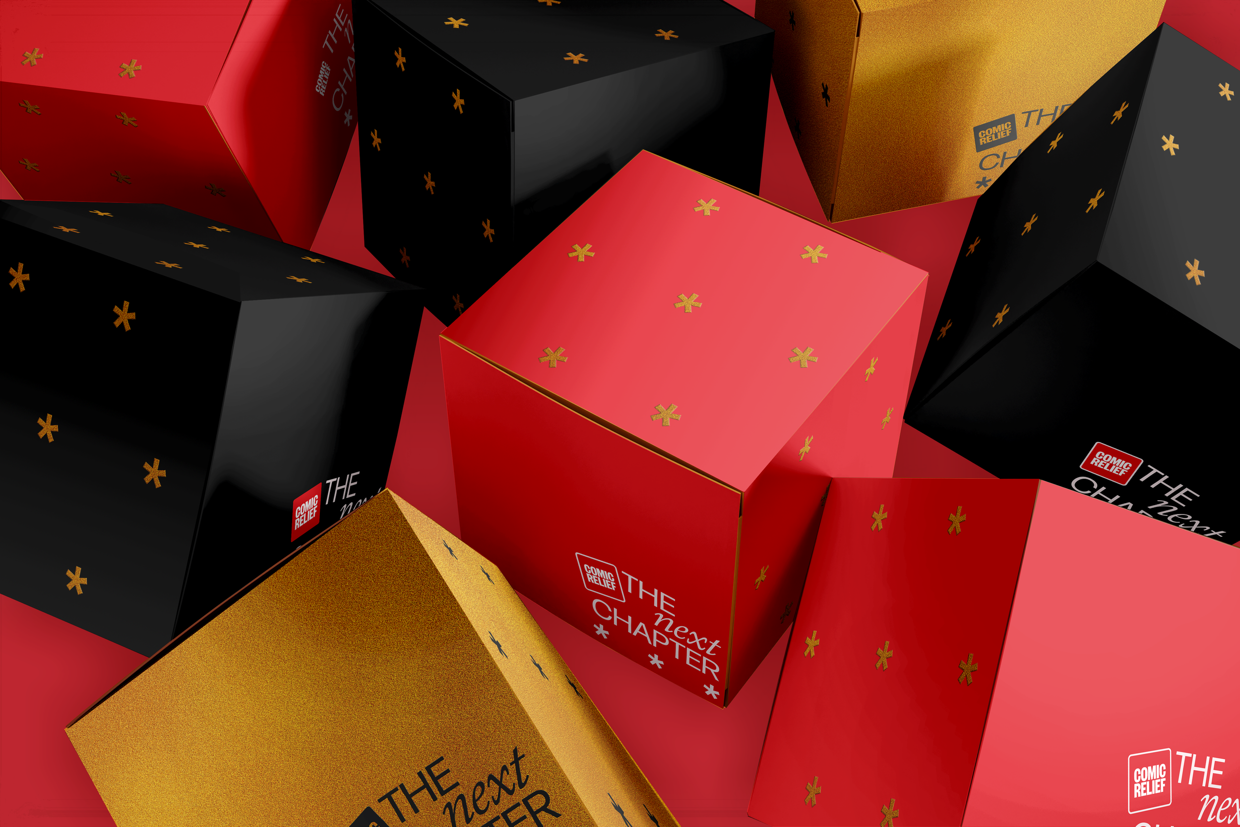
The identity was designed to live primarily across stationery and communications shared between Comic Relief and its major donors, so it was important to create something that felt refined, distinctive, and considered.
Premium production finishes — including foiling, embossing, and tactile applications — help elevate the identity and give it a sense of occasion.